By Shelby Sapusek
One of the most important decisions a new business makes is about brand colors. The color displayed in their logo and, therefore, their website, business cards, and marketing materials is the first impression that someone gets about the company.
What’s in a color?
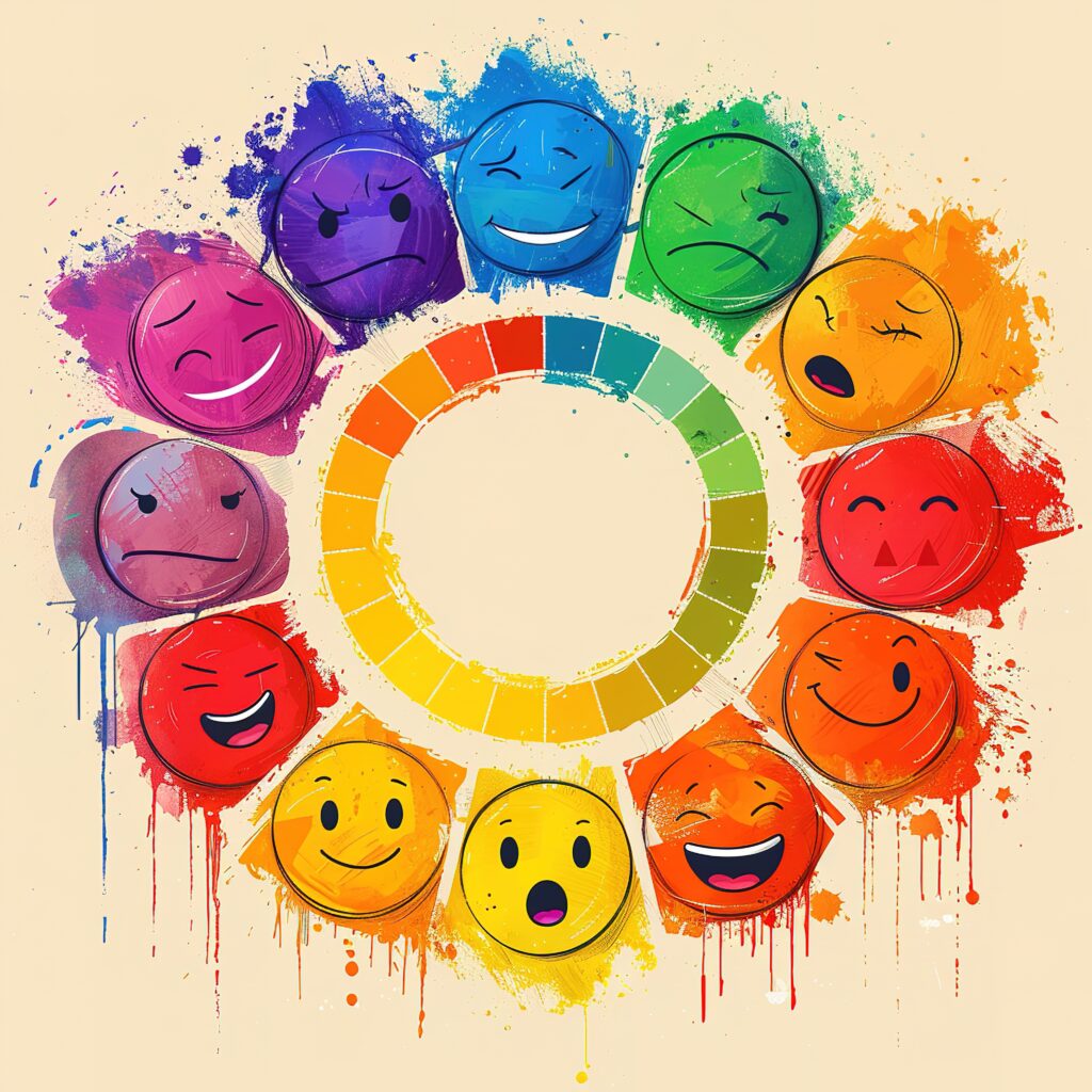
Whether we realize it or not, color evokes emotion. Red signifies anger or embarrassment, while yellow tends to promote happiness and a bright, optimistic outlook. Blue is calming, while gray or black can make us feel sad or depressed.
If you think about it, the colors around us are purposefully chosen. I bet you’ve never walked into a doctor’s office with black walls. Those black walls would likely give us an ominous, negative feeling right from the start of the visit. That’s probably not the emotion a medical office wants to convey. Instead, the walls are usually light and bright colors because those emit positivity.
Colors also signify specific actions. The best example of this is if you think of traffic lights. We are conditioned to recognize the actions related to the three colors of the lights. Red means stop, yellow means proceed with caution, and green means go.
Color vs. images in logos
As a color management consultant for my company ColorCasters LLC, I travel around the country quite a bit. As such, I meet many other travelers along the way—in airports, restaurants, hotel lobbies, or common spaces.
One of the common questions you receive as a traveler is: “What do you do for a living?” I used to give a 10,000-foot view of my career in color and print quality. I’d point to a product in the room and say that I make sure the color of its label is the same no matter where it’s printed, what it’s printed on, and where it’s displayed. Many people were surprised that there is paid work in color specifically. And that’s how I came up with my informal logo survey.
My new answer to “What do you do for a living?” was to say that I was a color management consultant and immediately ask them a question to explain what I do. I’d pick from several well-known businesses and ask them what color or colors represented them. It went something like this:
Me: “Home Depot.”
Them: “Orange.”
Me: “McDonald’s.”
Them: “Red and Yellow.”
Me: “Best Buy.”
Them: “Blue.”
You get the picture. I explained that this was a kind of color memory that big business brands hoped you would develop over time. If you saw a particular shade of orange, for instance, you would know you were looking at a Home Depot without even having to read the sign.
But then I took my survey a bit further to illustrate how important color really is.
Me: “Starbucks.”
Them: “Green.”
Me (changing it up): “What is the image in the logo?”
I asked this question about the Starbucks logo image dozens of times over the course of several months. What was interesting is that while everyone knew that the Starbucks logo was green, I would say only about 25% of the respondents knew what the image was in that logo. (Technically, it’s a two-tailed siren, but I accepted mermaid or merman as a correct answer in my unofficial survey.)
This illustrated that most people would recognize the color of a particular brand (in this case, Starbucks) before any imagery in the business logo.
What’s your brand color?
If you understand that colors evoke different emotions and that people relate to colors through memory, you are ready to consider what your brand color or colors should be.
There are several questions to consider when choosing how you define your business through color.
We invite you to take our unique brand color quiz on our website (you’ll find it at the bottom of this page) to get a starting point for your business personality.